%202.png)


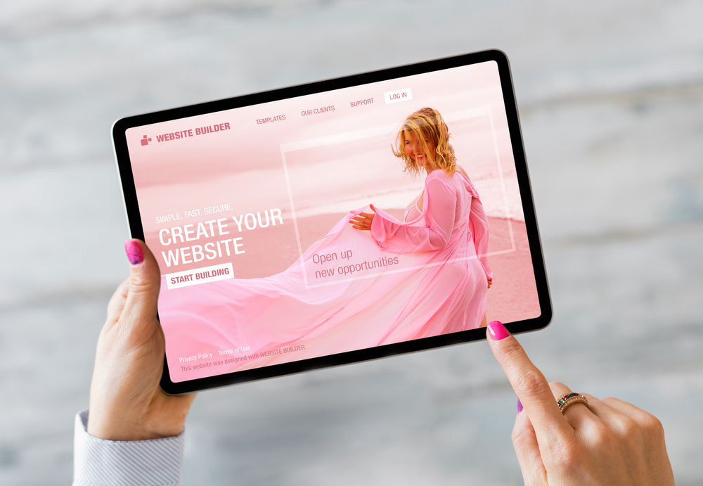
How to create an attractive landing page design
Want to draw users in with your online presence? An aesthetically pleasing landing page is the right tool for expanding your audience and providing users with a strong CTA so they convert.
The importance of web design
The design of your landing page is just as important as the content on it. A landing page is a page a user arrives on after clicking a link in an email or ad. It could be your website’s home page, another page on your site, or a page created specifically for a certain event, sale, or product.
Landing pages are found through keywords and high-ranking search results. They exist to convert users, so how you design them is critical to whether you’ll succeed in reaching new users.
Tips for designing your website
Here, we’ll look at six tips for designing an attractive landing page, plus an example of a great landing page.
1. Use your brand colors
To keep consistency across your social media platforms and your landing page, use your brand colors. If users recognize the colors from your social media or other online spaces, they’ll be more likely to trust your landing page. The colors can create a familiar, engaging space for users, which makes them more likely to convert.
Now is also a good time to evaluate your brand’s colors and common associations with them. Check out CoSchedule’s color graphic that lists common positive and negative associations for colors. (These differ across cultures, so be mindful of that, especially with a large international audience.) We have a built-in response to certain colors, so it’s important to be aware of those associations and see whether they’re helping or hurting your content. For example, purple is often associated with royalty, ambition, and wealth. Many brands selling luxury products incorporate purple because their products make people feel like part of the elite upper class.
Let’s look at our example landing page from fitnessblender.com, a workout site with hundreds of videos (paid and free) for people at all fitness levels. FitnessBlender has videos from physical therapists, personal trainers, yoga experts, and more to accommodate different training styles, fitness levels, and body capabilities.
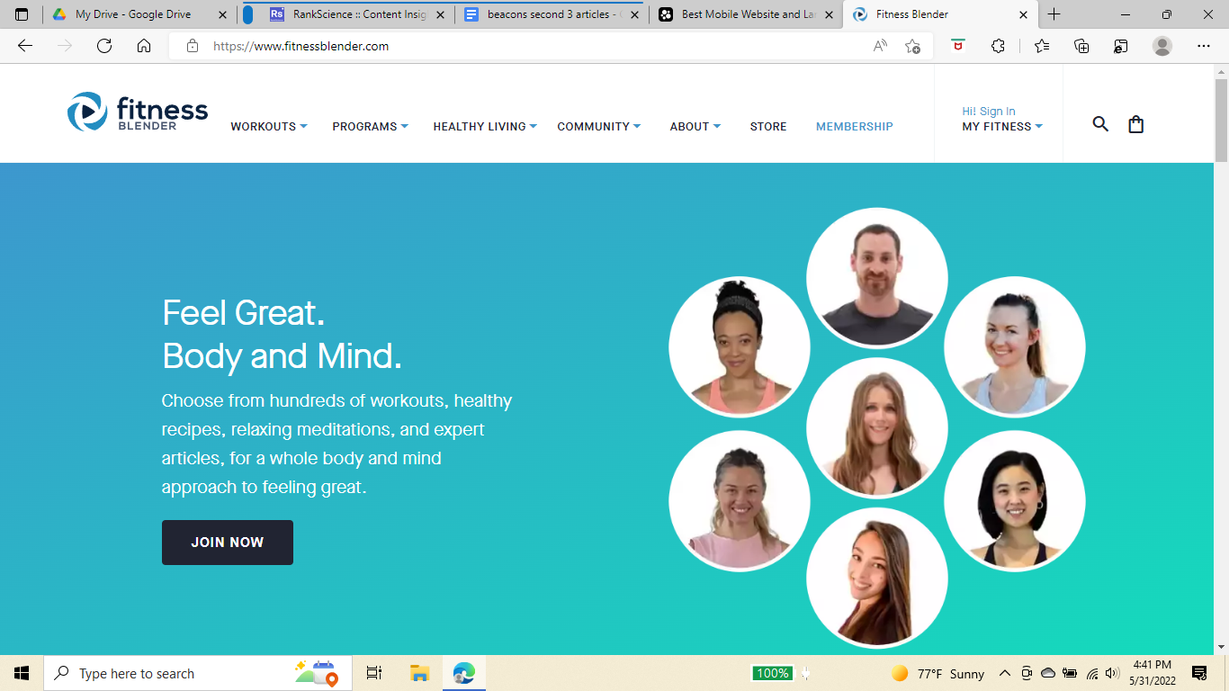
The colors here are an aesthetically pleasing mix of blue that transitions to green. FitnessBlender starts with blue as they describe the workouts they offer to benefit body and mind. Blue is one of the most well-liked colors across the world, which speaks to FitnessBlender’s international audience. It’s also associated with dependability and mental peace, reassuring users they can trust FitnessBlender to deliver on promises of better health.
Then, as the page transitions to pictures of the workout instructors, the color fades into turquoise. Incorporating green here reinforces positive associations with the brand’s color, such as balance, wellness, and peace — exactly what FitnessBlender provides with its workouts.
Brand colors are too often overlooked as the powerful tools they are. Work them into your landing pages to reinforce positive associations and build consistency across your content. Let tried-and-true associations do the work for you instead of reinventing the wheel.
2. Make sure fonts are easy to read
It’s tempting to use decorative or elaborate fonts, but easy-to-read fonts are the best options for your landing page. They keep things simple for users and don’t distract from your landing page’s main goal, which is to get users to follow your call to action or CTA.
FitnessBlender uses a simple white font so the words stand out against the blue-green background. The headline is bolded so it catches users’ attention. The subhead is the same color and font (but unbolded) and elaborates on the promise made in the headline. Finally, the CTA button has white text, but the button itself is black so the words stand out even more. There’s nothing fancy about the text itself, but the accessible font conveys the message beautifully and makes the CTA hard to miss.
3. Add related graphics and beautiful images
Pictures and graphics are the first thing users will be drawn to on your landing page. Our brains process images 60,000 times faster than words. If users will absorb more information faster from one picture than all your text, that picture should be excellent!
Let your images take up space on your landing page. They should be high quality and reflect who you are or what you’re selling (the same goes for graphics). A cosplayer on Instagram wouldn’t want a photo of themself in a business suit on their landing page. Instead, one or two of their best cosplays would do a much better job at capturing users’ attention. Those images also multitask by immediately showing users’ the cosplayer’s skill and content.
If you’re selling something, your images should connect to your product. If you’re offering a service, your images should demonstrate how that service is relevant to the people visiting your landing page. For example, a creator sharing gardening hacks on TikTok could have a landing page with cute graphics of unruly gardens along with a headline that offers help fixing this problem. This allows the creator to demonstrate their relevance while enticing users to keep reading and follow their CTA (more on this later).

Keep your images high quality so you make the best possible impression on users. This is probably the one area FitnessBlender could improve on. The pictures of the different trainers are noticeably different in quality. Still, they provide transparency for users and demonstrate that they value diversity because they themselves are diverse. Even though the quality isn’t the best, the images still do a good job of emphasizing how accessible FitnessBlender is for everyone.
4. Have a clear call to action
Don’t let anyone click away from your landing page because they don’t know what to do or where to go next. Even if users are interested in you and your content/products, if you don’t direct them to a clear next step, they’re less likely to stick around.
A good way to emphasize your CTA is to have clear, powerful, and engaging headlines and subheadlines. While these aren’t your actual CTA, they’re important for getting your audience interested so they’re more likely to follow the CTA itself.
Let’s look at a few tips for good headlines. They should:
- Get the reader’s attention,
- Tell them what you and your content are about, and
- Be short (preferably 10 words and never more than 20).
Headlines make it clear who you are and what you’re offering, whether that’s content, products, or something else. If you want to advertise yourself or your brand on your landing page, consider a headline that summarizes your brand rather than specific content, a product, or an event.
And what about subheads? If a headline’s the hook that gets users intrigued, a subhead is a reel that draws them in and pushes them to convert. Both elements are critical in guiding your user towards that CTA. Subheads should elaborate more on your headline so users know what you’re offering and what problems you can solve with your content or products.
By the time users reach your CTA, you want them to have a good idea of what they’ll be missing out on if they don’t follow the CTA and what they’ll gain from following the CTA. As humans, we naturally seek out ways to avoid pain. If you set up a problem on your landing page that’s solved by you and your content or products, you’ve given users the perfect solution. If you tap into the emotional fulfillment behind your brand, you’re appealing to what users will gain. Even products and brands that don’t seem emotional can do this!
FitnessBlender uses excellent headlines and subheads to push users toward their CTA. They have a short headline “Feel Great. Body and Mind.” to emphasize their holistic approach to fitness. The subhead gives users all the things they’ll gain from using FitnessBlender’s videos that culminate with better physical and mental health. Conversely, users understand that they’ll be missing out on these benefits if they don’t join FitnessBlender, which is why putting the CTA button right under the subhead is perfect.
Your CTA is the most important part of your landing page. It allows users to connect with you — starting a relationship you can build on in the future.
5. Keep your page clean and organized
Less is more.
It’s tempting to stuff your landing page with all your content, products, events, and merch, but if you give users too many options, they’re likely to not act at all. A strong CTA gives them one choice to make and an easy way for you to track whether your landing page is effective based on how many users follow that CTA.
Don’t feel like you need to crowd your landing page with tons of images and graphics. If it feels overstuffed or confusing, users are more likely to click away. And your CTA won’t be as clear if it’s overwhelmed by too many images. The simpler your page is, the more user-friendly it is — and the more likely users will convert.
Ultimately, there’s no single formula for creating the perfect landing page, because so much of it depends on you, your content, and your audience. A hiking Instagrammer wouldn’t have the same landing page as a food blogger. But effective landing pages do have some things in common, such as a clean and organized structure. You decide where to place your headlines, subheads, and CTAs as long as they benefit the user’s experience. And if you’ve converted users with your landing page, they’re more likely to check out your website and social media, where you can direct them to all those other links that show off more great content.
Remember to keep the user experience top of mind
The most important thing to remember when creating a landing page is to be user-friendly. Don’t forget to make your landing page mobile-friendly to accommodate people browsing on their phones (which is most of us these days).
An inviting, engaging landing page encourages users to spend more time with you and your content, giving you a great opportunity to build relationships online.
Grow With Beacons
If you’re looking to build the best website possible, try Beacons for free today! You can build your own website from your phone in minutes. We have tons of options, so you can customize fonts and layouts to best fit you and your brand. And you’re able to put all your social media, event, and merch links in one place so users can find more information about you after they’ve followed your CTA. Sign up today to see why millions of creators benefit from Beacons!


%202.png)